The all-new WeTransfer.com.
I was lucky to be part of WeTransfer’s 2016 redesign. With a core team of eight, we set out to make a faster, more secure and more reliable service through research and design. Five months later, the new WeTransfer rolled out to 195 countries.
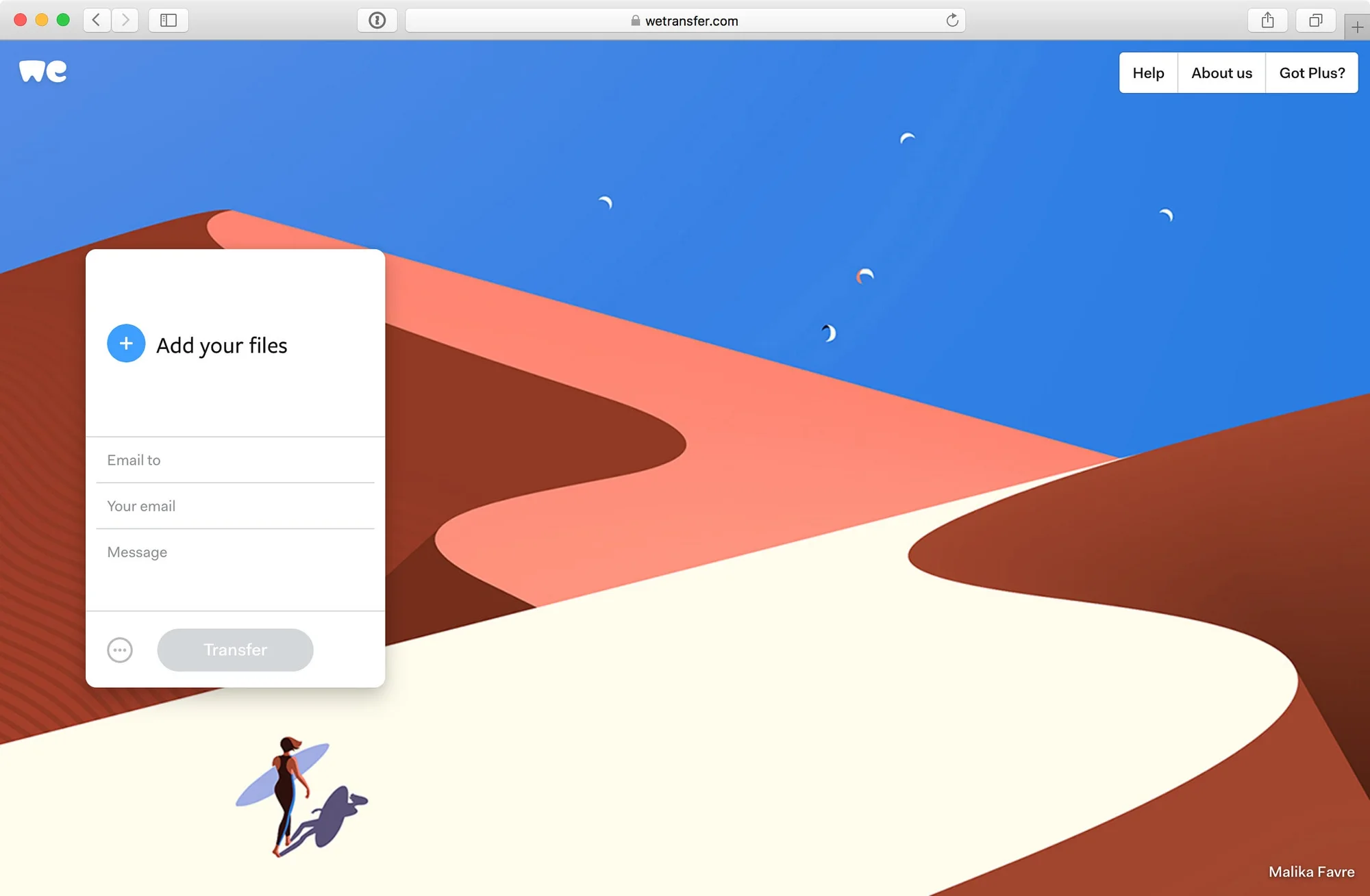
Design it like you’d design for your mum.
That was our guiding principle for a product used by millions of people every month. The new version moved WeTransfer onto a flexible foundation while keeping the simplicity people loved.
- Visible navigationThe menu came out from behind a small label, with panels that slide in next to the transfer box.
- A box that growsSections expand with their content instead of scrolling in tiny windows.
- Single-file downloadsEvery file in a transfer can be downloaded on its own, not only as a zip.
- Personalization in placeWallpapers and email backgrounds set right in the interface.
Read more about the design process in the team’s article on Medium.
Credits- TeamNalden, Thomas Offinga, Thomas Schrijer, Mirte Becker, Thijs Remie, Laszlito, Stijn Eversdijk